Masterclass in UX/UI Design
This is a long awaited post of my experience at UX/UI Masterclass (04.06.16) ran by Code First: Girls in partnership with Women Hack for Non Profits hosted by ThoughtWorks. The day was lead by the wonderful Elizabeth Chesters who was also my instructor for Code First: Girls Advanced Ruby course!
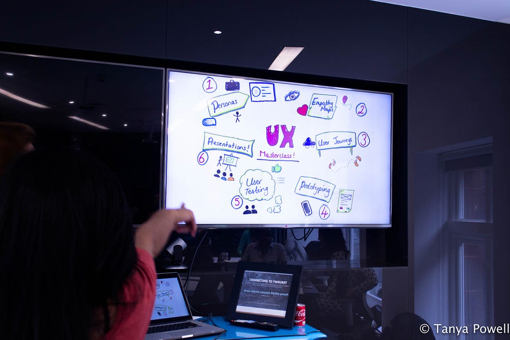
Project Objectives
- Learn typical processes of UX/UI design
- Importance of personas, empathy mapping, user journey, user testing (prototypes)
- Come up with an app which solves a problem
Brief
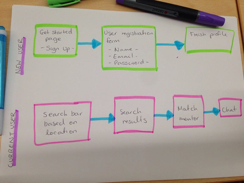
Our app was aimed at finding a mentor to help a user learn UX design and consequently get to shadow the mentor. The user finds nearest available mentor through location search and gets to choose which mentor they would like to connect with.
Personas
First and foremost, we needed to establish our persona which we would be targeting. This included:
- Age: 25–40
- Occupation: just out of uni or career change
- Location: London
- Goals: networking, projects (to perhaps show), guidance
- Frustration: money
- Requirements: easy to use app — no second guessing
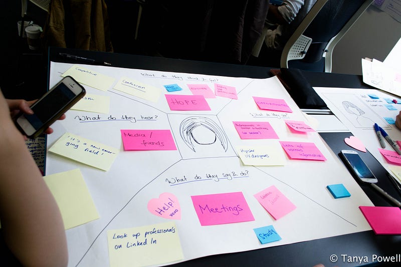
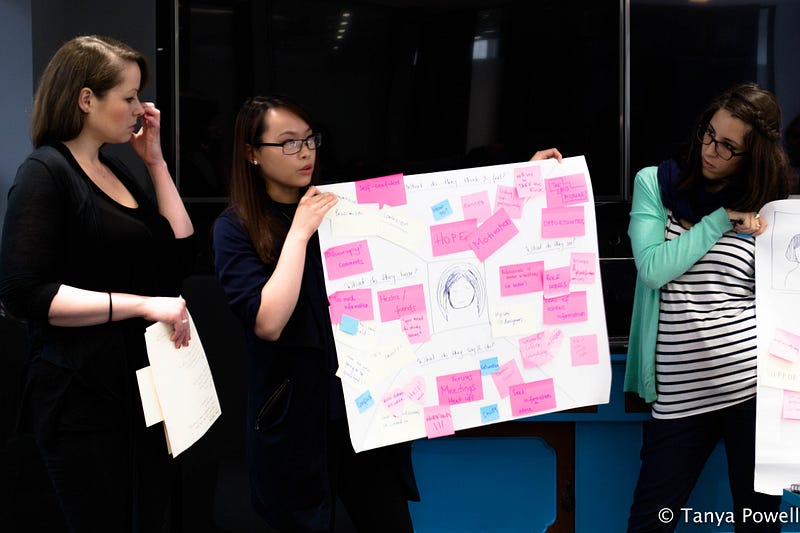
Empathy Map
This stage helps us to be in the user’s shoes and come up with assumptions on how they would feel, think, hear, see and do.
User Journey
We made a user journey for both new user who are signing up and a user who is already logged in. For this part of the project, you want to make the journey as linear as possible therefore focusing on your primary feature. As the app develops and gains popularity, you can then add other features.
Prototype — User Testing
We made simple prototype pages for our app, although we concentrated on the searching for mentor feature as this was our primary goal.
For user testing we had a member of another group to look at our prototype. We explained what the app idea was and walked them through the prototype pages. We started off by asking what they think of the search page. One thing we found out was that an arrow pointing right did not make much sense to the user and they did not know what to do with it after inputting keywords into the search bar. For this reason we implemented buttons with text such as ‘search’ and ‘next’ which is more intuitive and clearer. If a user encounters a problem with user interface or they don’t understand what to do in between the app pages, there is a risk of them giving up on the app.
What I Learned
- Researching on user behaviour and interviewing should be carried out at the beginning — be mindful of when users may not want to be approached e.g. rush hour or families in shopping centres during half term
- Face to face interview is always the best option as it allow you to see the user’s body language, facial expression, behaviour etc.; if not possible then over the telephone is okay as well
- What day and time of the day would the user look at your app — be mindful of when to send notifications e.g. during the weekend when they’re more likely to look at their phone less stressed
- Do not get attached to the first few prototypes as they will go through many changes after user testing; at the end of the day it’s the user that will use it
Overall it was a great day packed full of information on UX/UI design!
- - -
This blog post has also been published on medium.